By Ethan Kuo
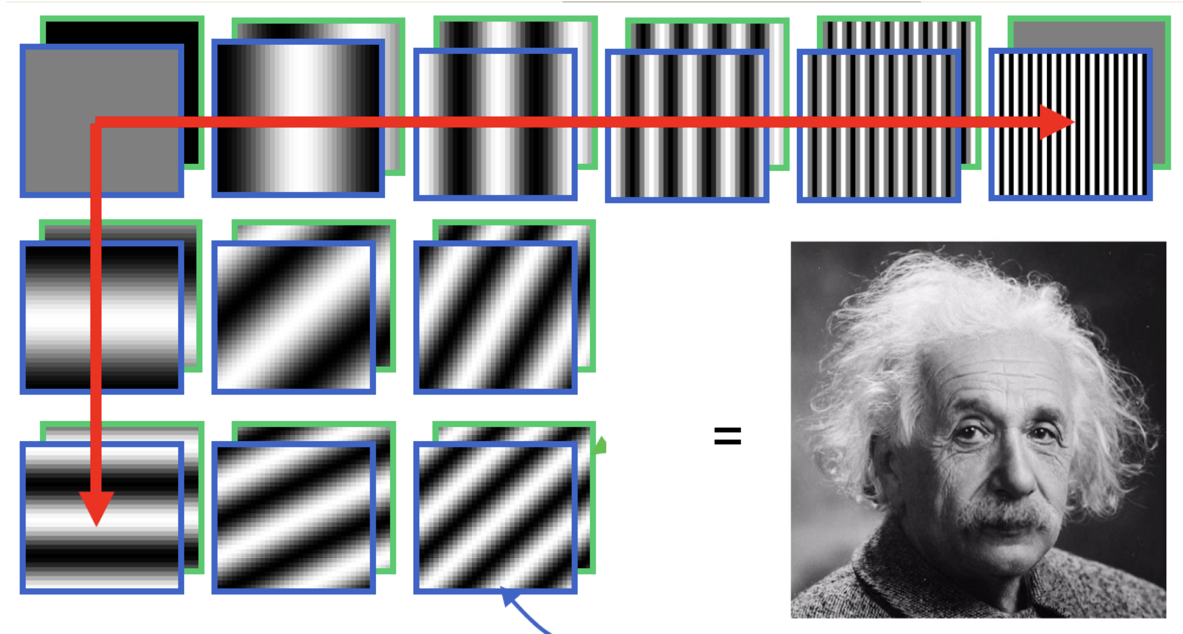
When we think of how images are represented, we typically think of the spatial domain: pixels and their intensities, such as in RGB. However, we can also view images in the Fourier domain, which relies on the amazing fact that any image can be represented as a sum of sinusoids!
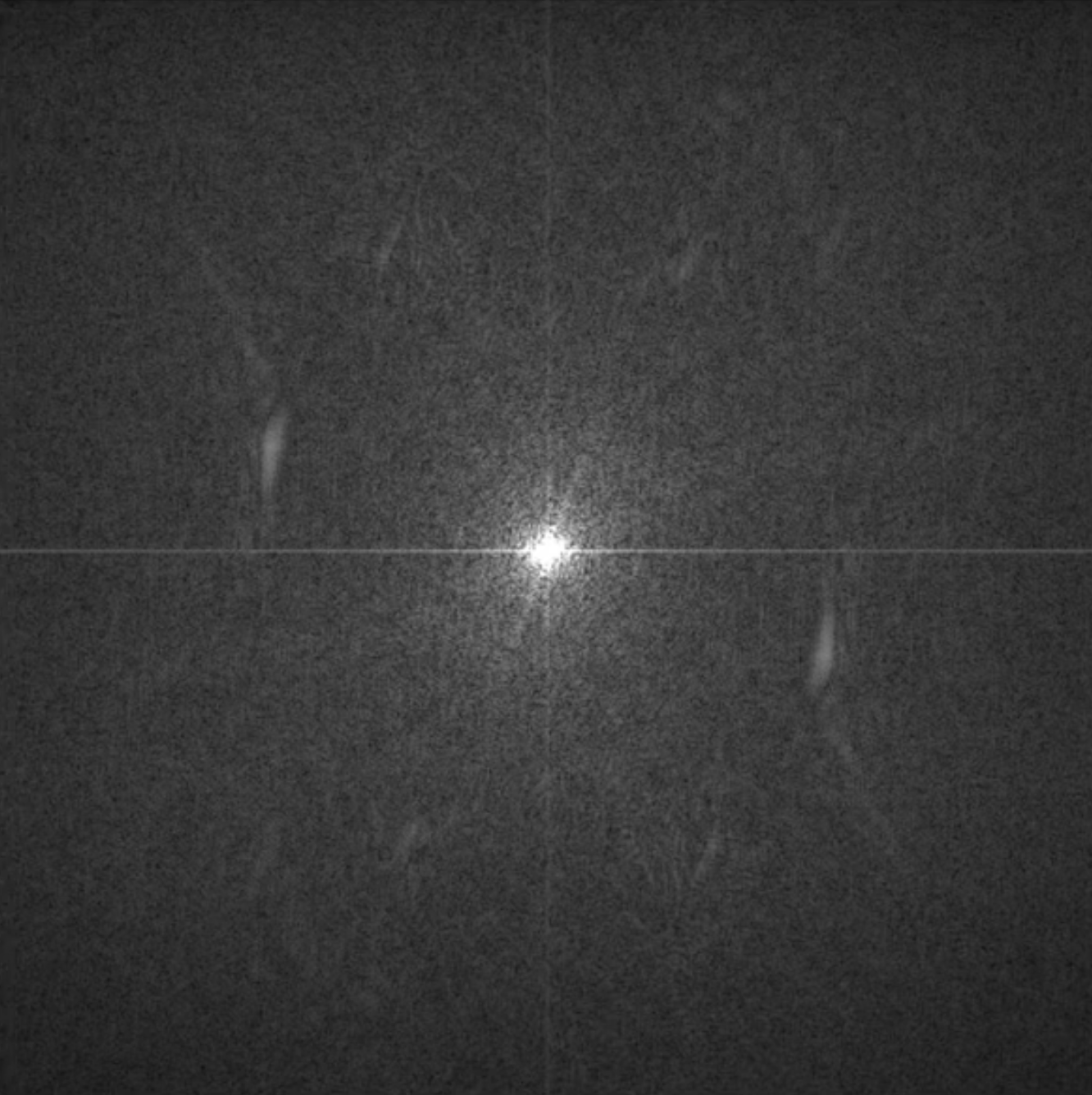
Take this Albert Einstein image for instance. One way to represent this image is a 2D matrix, where each entry holds the pixel intensity at a coordinate. But since this image also is a weighted sum of many of these "sinusoid images," each with a unique frequency and direction, we can also cast the image in the Fourier domain, where white points correspond to highly weighted sinusoids and black points correspond to lowly weighted sinusoids. Essentially, the Fourier image tells us which frequencies are important to an image.


But what do frequencies mean in the context of an image? High frequencies capture the fine details in an image, such as edges, while low frequencies capture big-picture structure and approximations in an image. And this makes intuitive sense! A "sinusoid image" with high frequency will match up well with, say, the repeating edges in a plaid shirt. And one with low frequency will match up well with the rolling green gradient of a hill.
In this project, we explore interesting transformations of images, with a keen interest in their Fourier representations.
Derivatives are functions that tell us the rate of change at a point. In images, we can use a similar concept to compute a rate of change at a specific location in a discrete image. We convolve the image with a finite difference filter to identify areas with a high rate of change in the x and y directions.

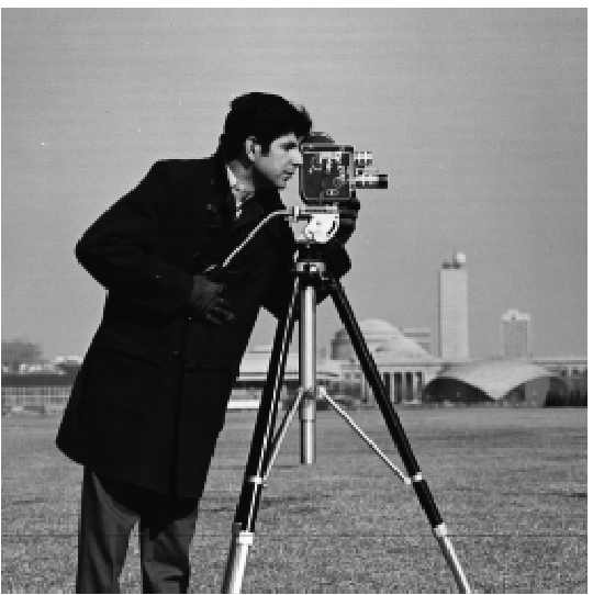
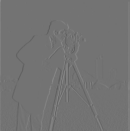
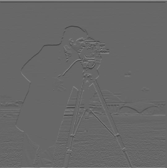
Now we can compute the gradient magnitude of the image, which essentially combines the rate of change in the x and y directions to show how much an image is changing at a point. It turns out that the gradient magnitude works well as an edge detector, since edges generally represent a sharp change in the image and thus have high gradients. Then, we pick a threshold for the gradient magnitude to classify edges and ignore some nosie.


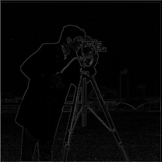
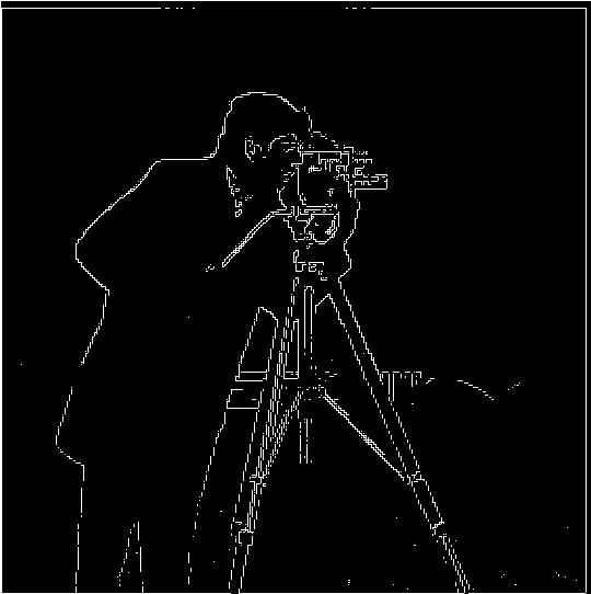
Our previous edge detection image is a bit frizzy. We can fix this by first blurring the image using a Gaussian filter before computing the gradient magnitude. This works because non-edges are likely to be smoothed out, observe a low gradient magnitude, and thus not be misclassified as an edge.

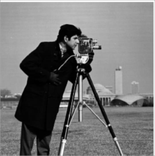
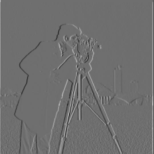
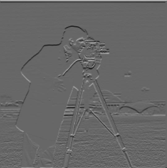
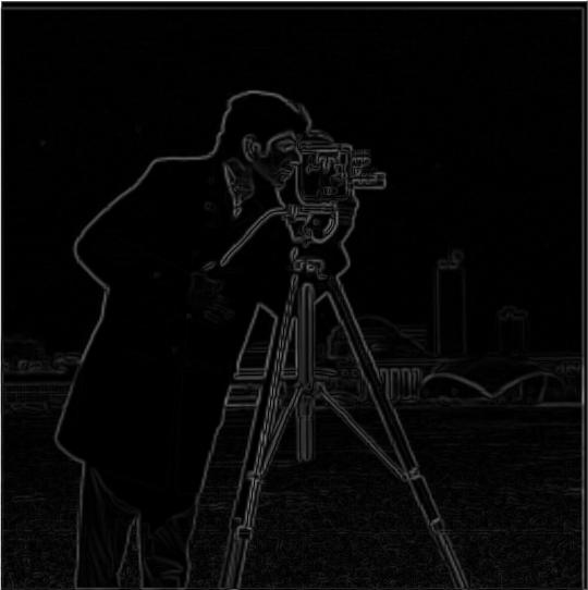
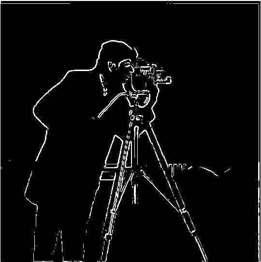
Now that our edge detection is more crisp, let's introduce a performance optimization. We can combine the Gaussian blur and finite difference operator into a single convolution. The derivative of Gaussian (DoG) filter is created by convolving each finite differences operator with the Gaussian filter.
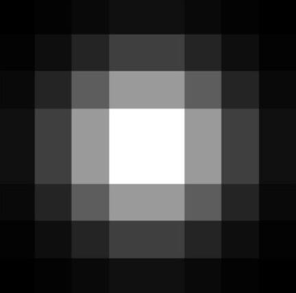
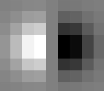

Then, we can simply convolve the DoG with the image rather than convolving both the Gaussian filter and finite difference operators individually on a potentially large image. Notice the results are the same as before.


A sharpened image displays its fine details more strongly, which involves accentuating its high frequencies. Here we employ the unmask sharpening> technique: obtain a blurred image using a Gaussian filter, subtract that blurred image from the original image to obtain high frequencies, then add that back into the original image (weighted by some alpha). Best of all, we can combine all of these operations into a single convolution, as shown below.

Here, I show the progression of getting the low and high frequencies for clarity, but the last image shows that the unsharp mask filter does all of the steps in a single convolution.
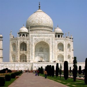
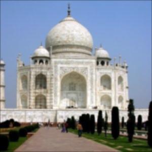
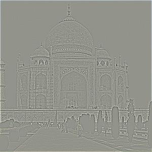
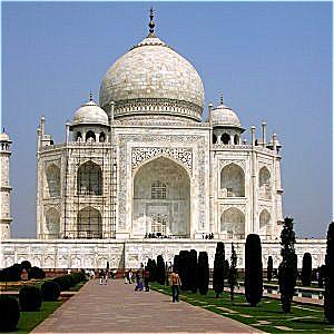

Here, I sharpen some more images using the unsharp mask filter. The differences are subtle, so it may help to zoom in.
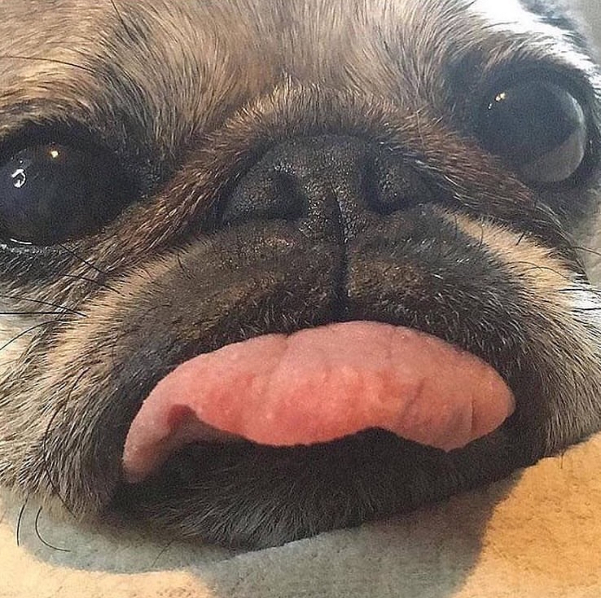
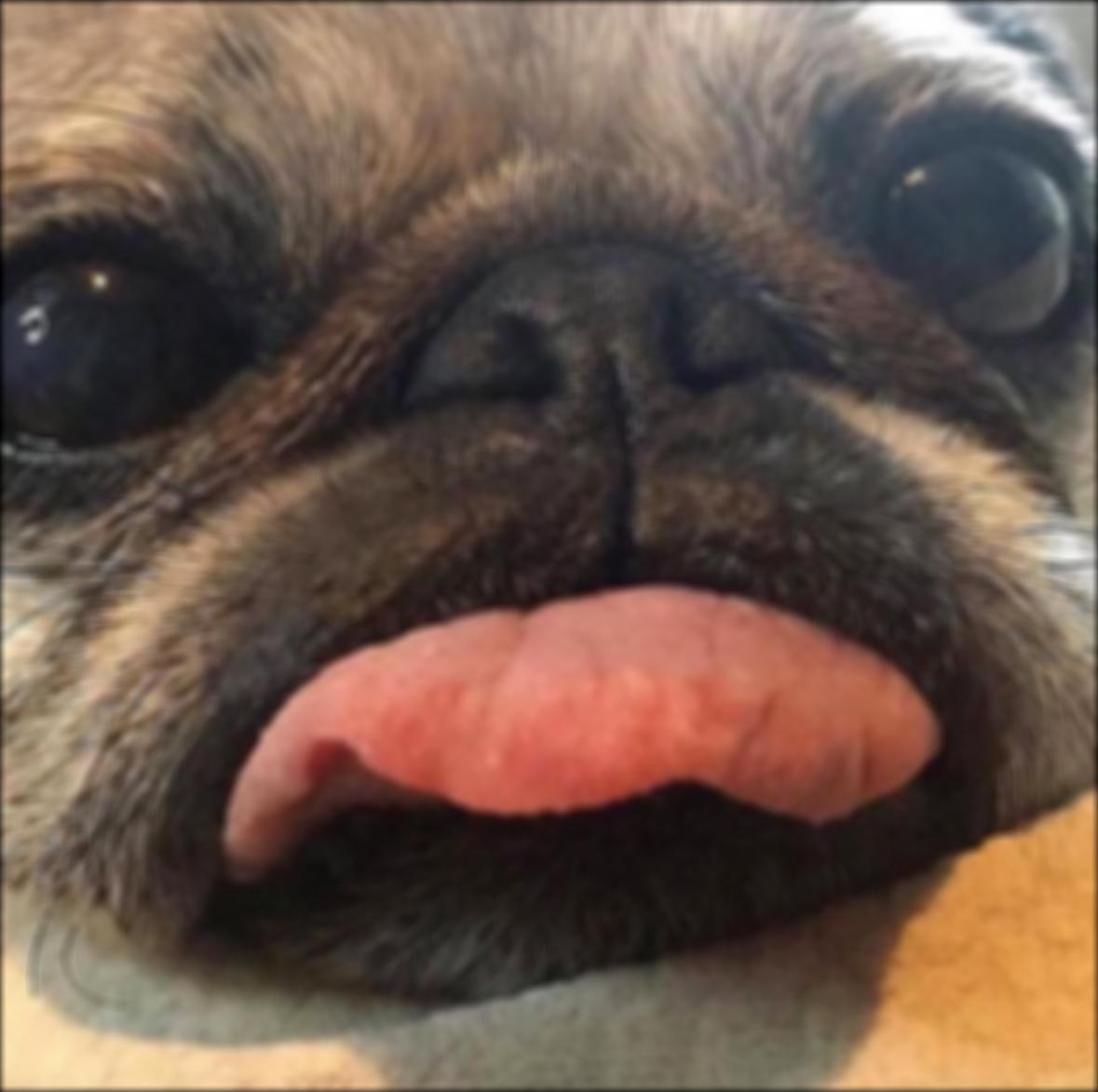
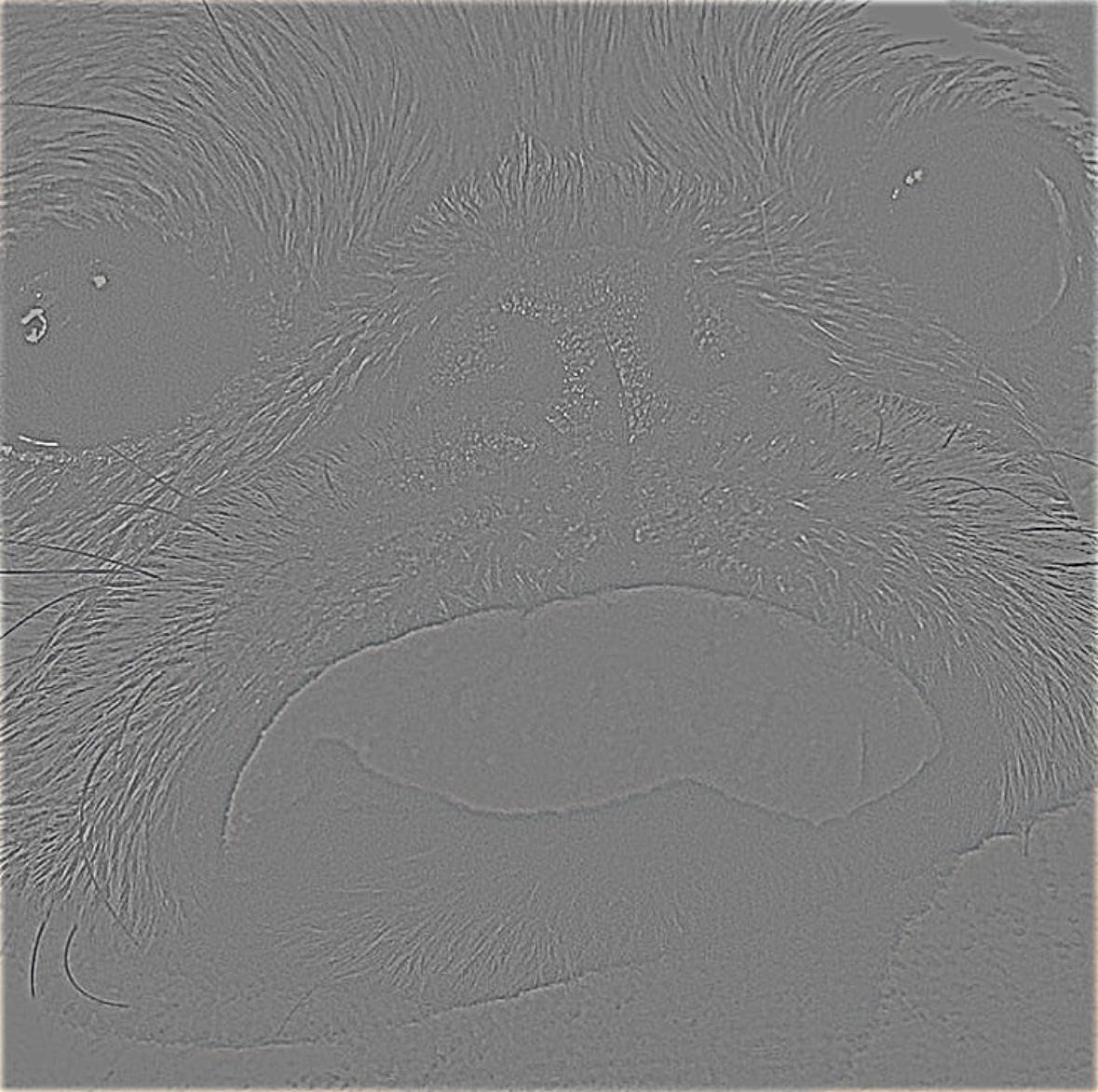
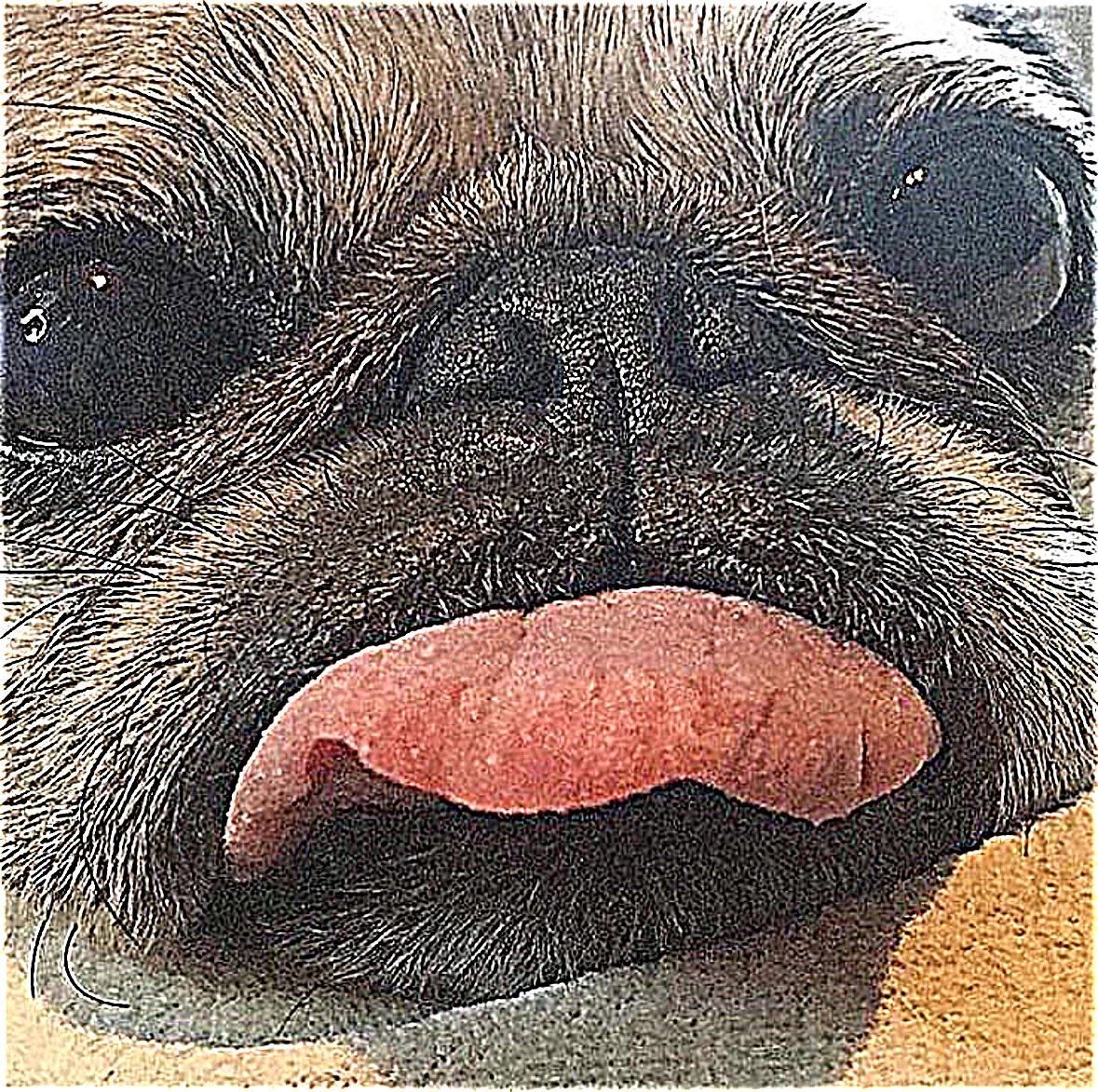
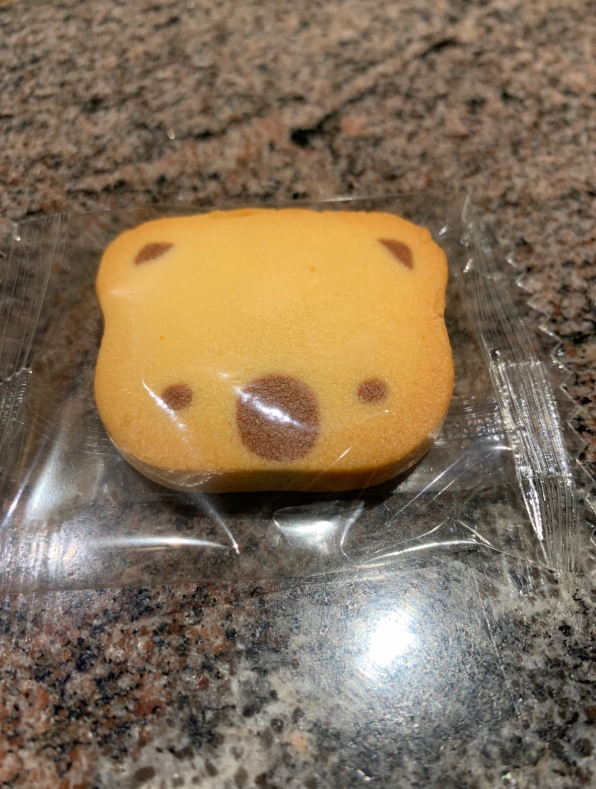


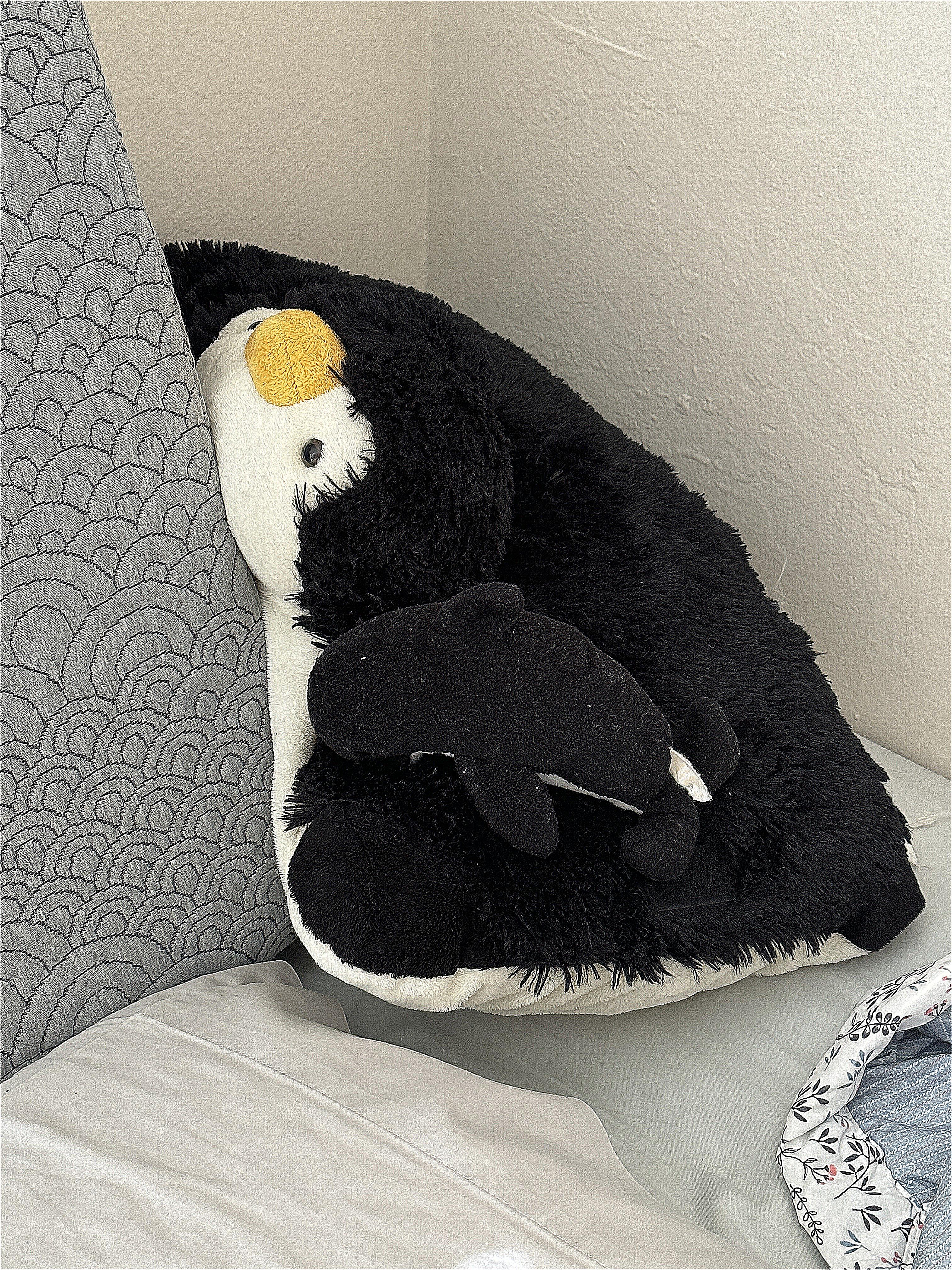
Here's an interesting experiement: let's blur an image then sharpen it, then compare it with the original image.
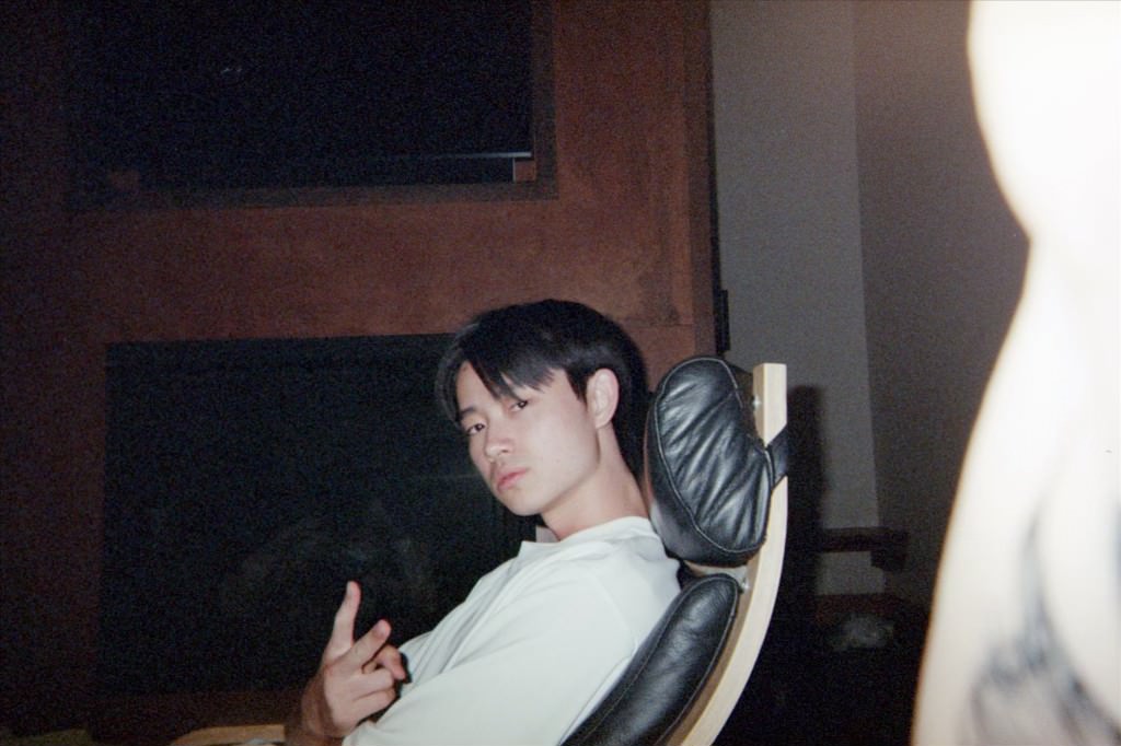
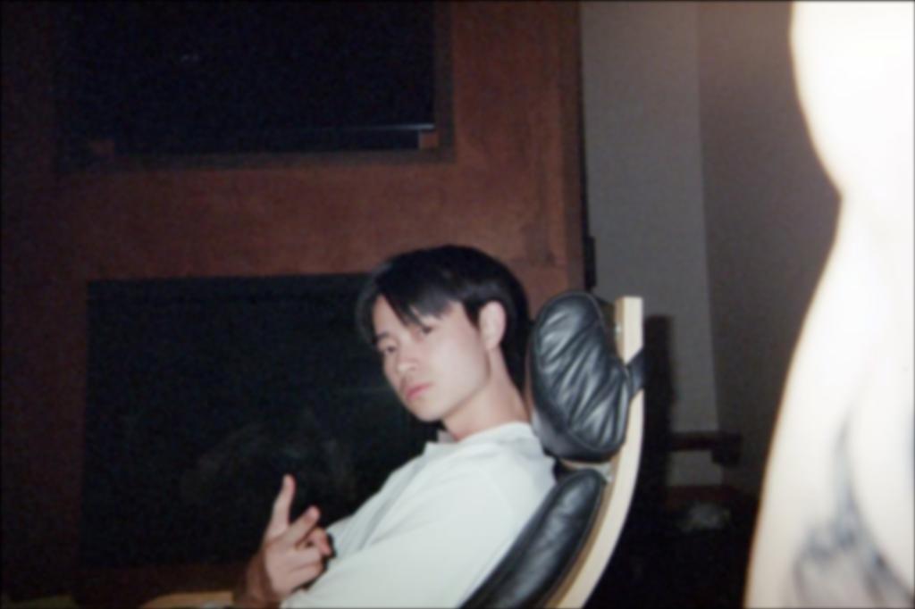
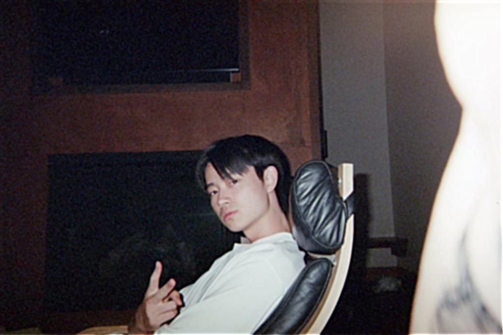
The sharpened image definitely doesn't look blurry anymore, but if we look closely, the image seems to have lost some fine details and looks more "choppy". But overall an decent restoration!
A hybrid image is an optical illusion where you see one image close up and a different image far away. We can create hybrid images by layering the high frequencies of one image with the low frequencies of another image. Since high frequencies can be seen better close up and low frequencies from far away, we achieve this cool morphing effect.
We will isolate the high and low frequencies of an image using Gaussian filters as before. The kernal size and standard deviation of the Gaussian filter we use determines the "cutoff frequency" in the images. Roughly, this means that the low frequency image will include all frequencies below the cutoff while the high frequency image will include all frequencies above the same cutoff. Choosing a higher kernal size and standard deviation lowers the cutoff frequency, and vice versa. Finding a balance is important for an effective hybrid image.
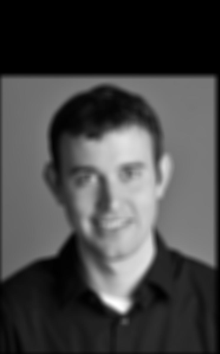
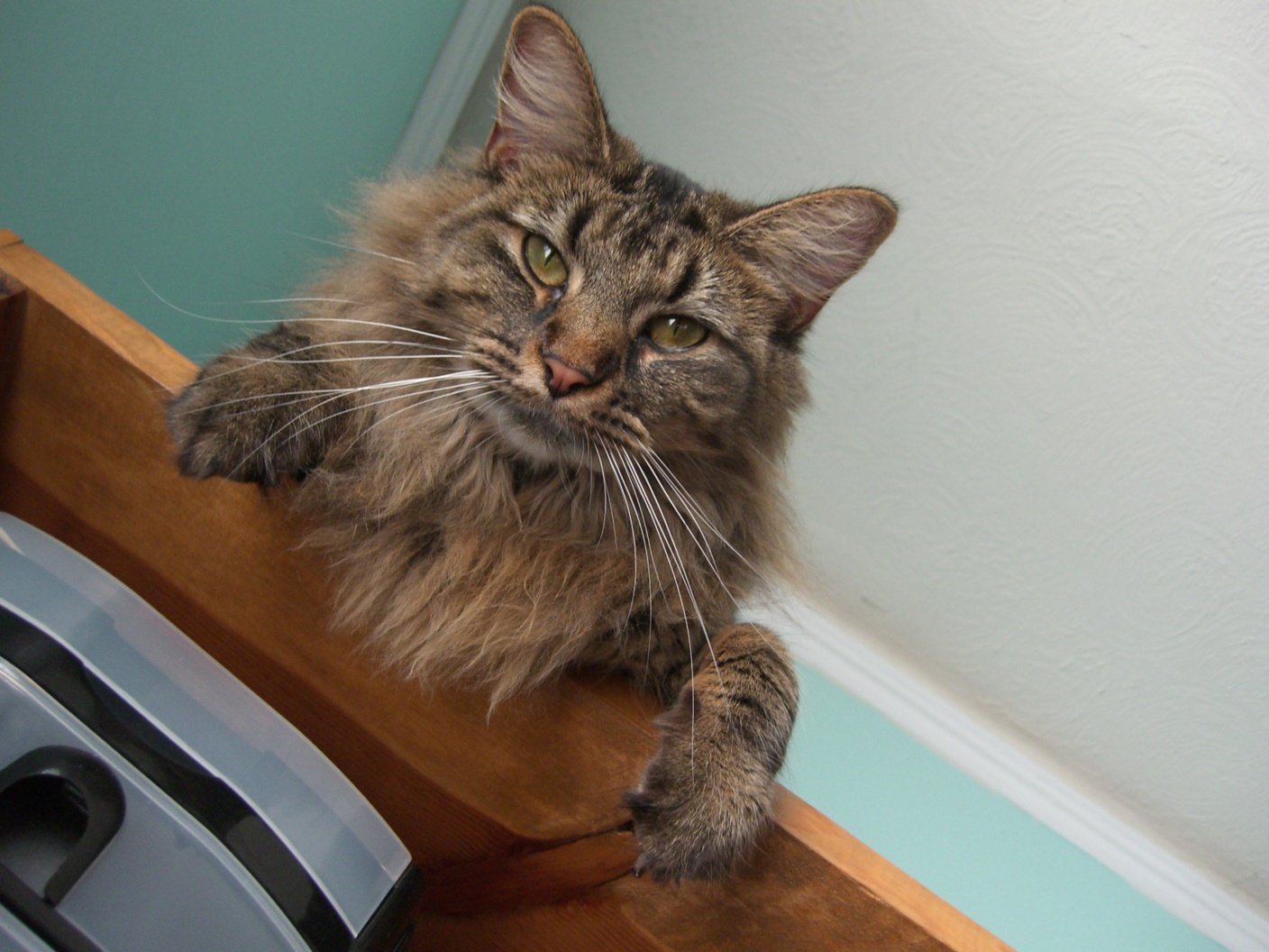
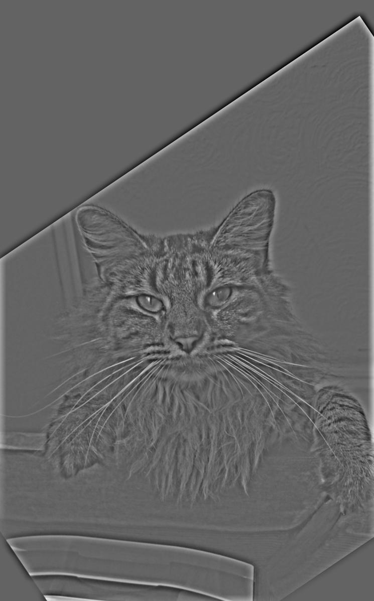
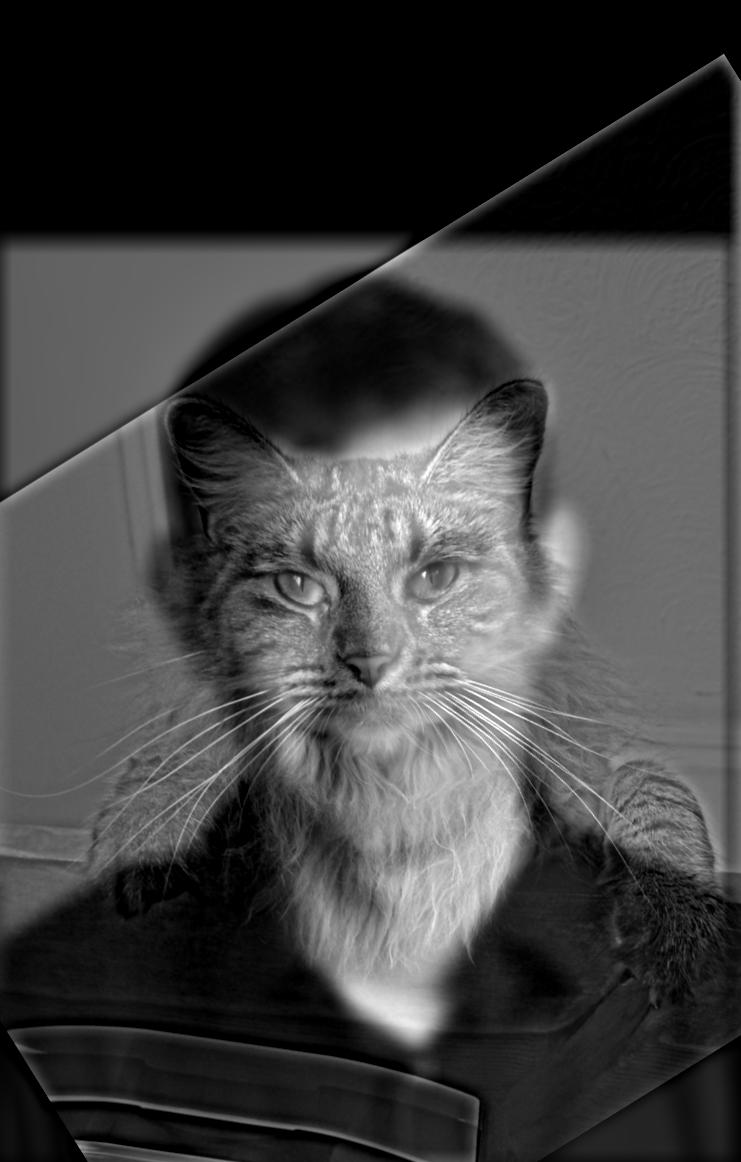
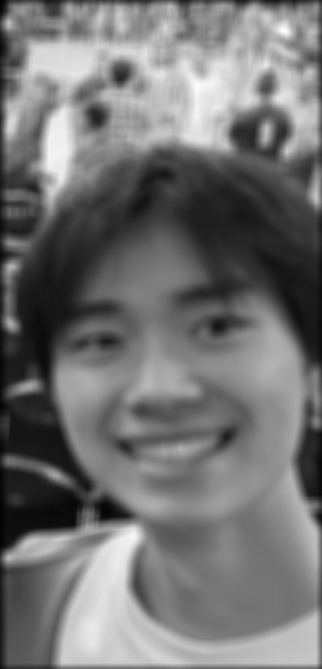
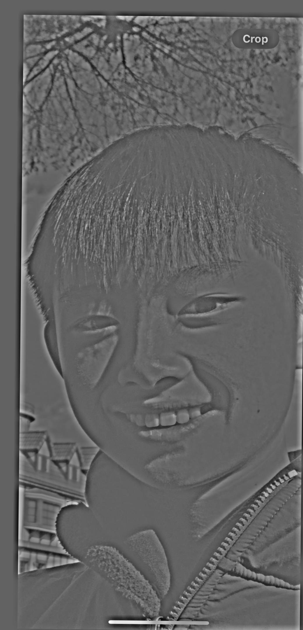
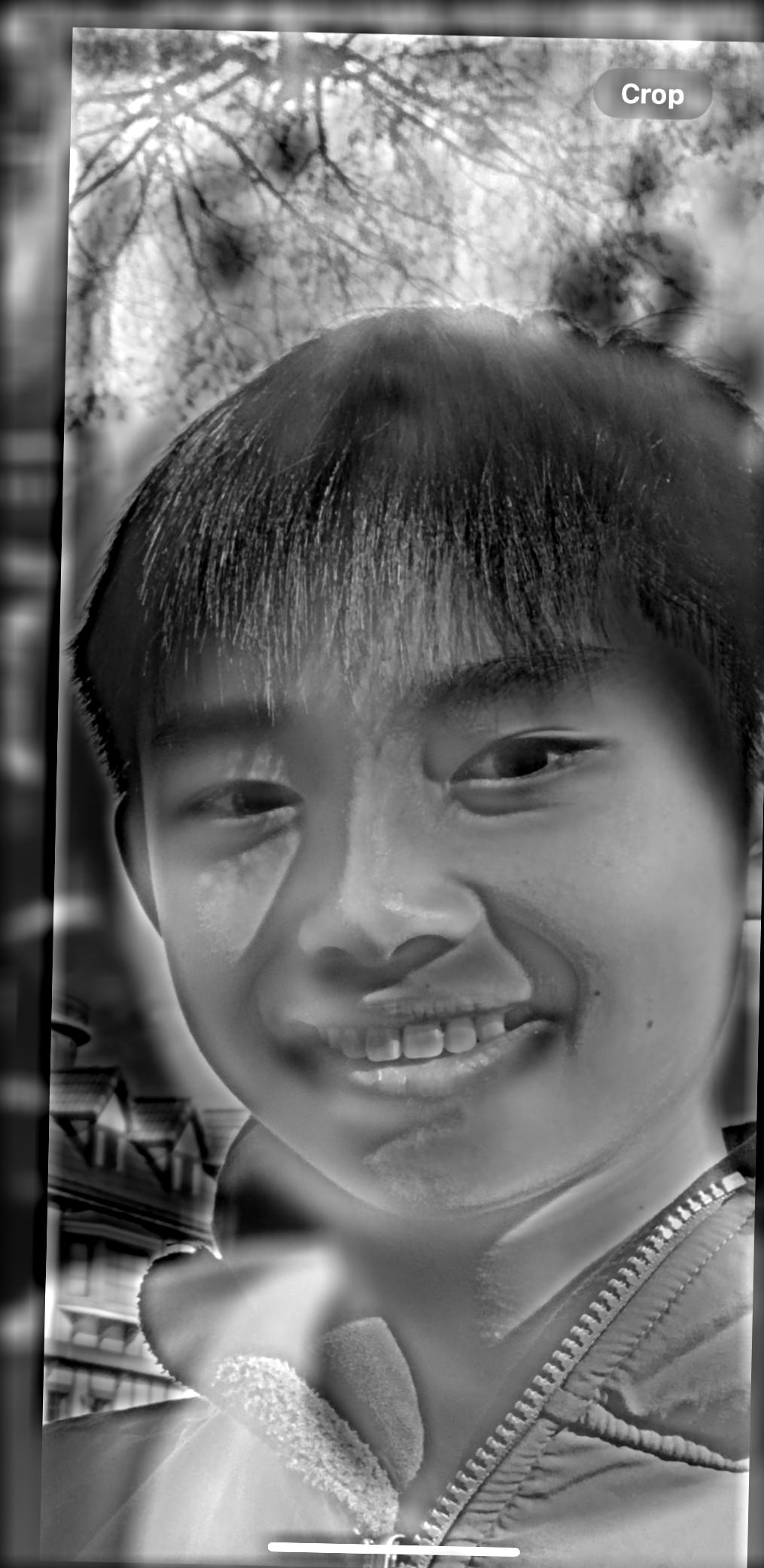

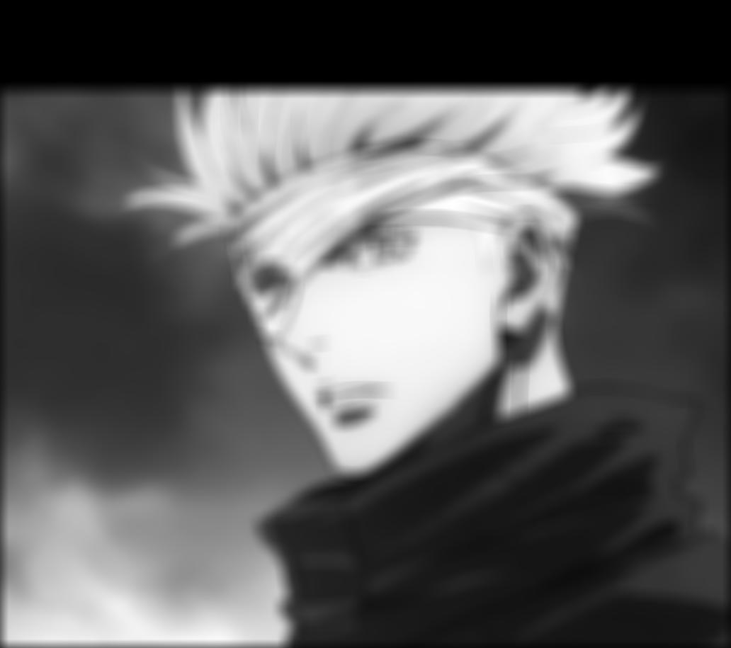

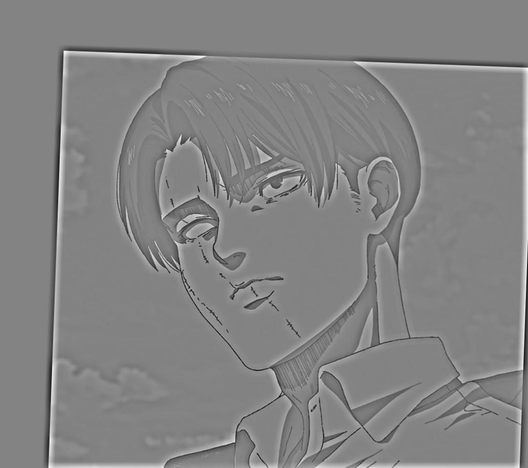
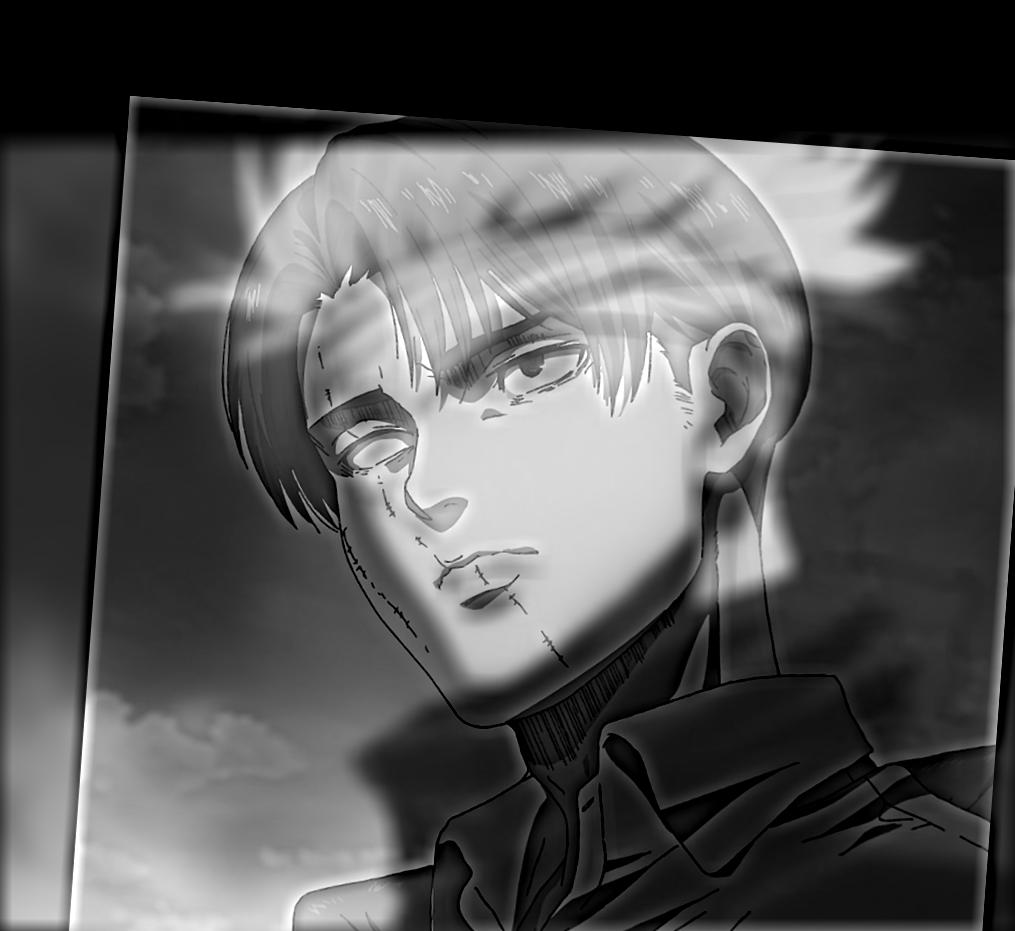
This one is my favorite, so here are the images in the Fourier domain!
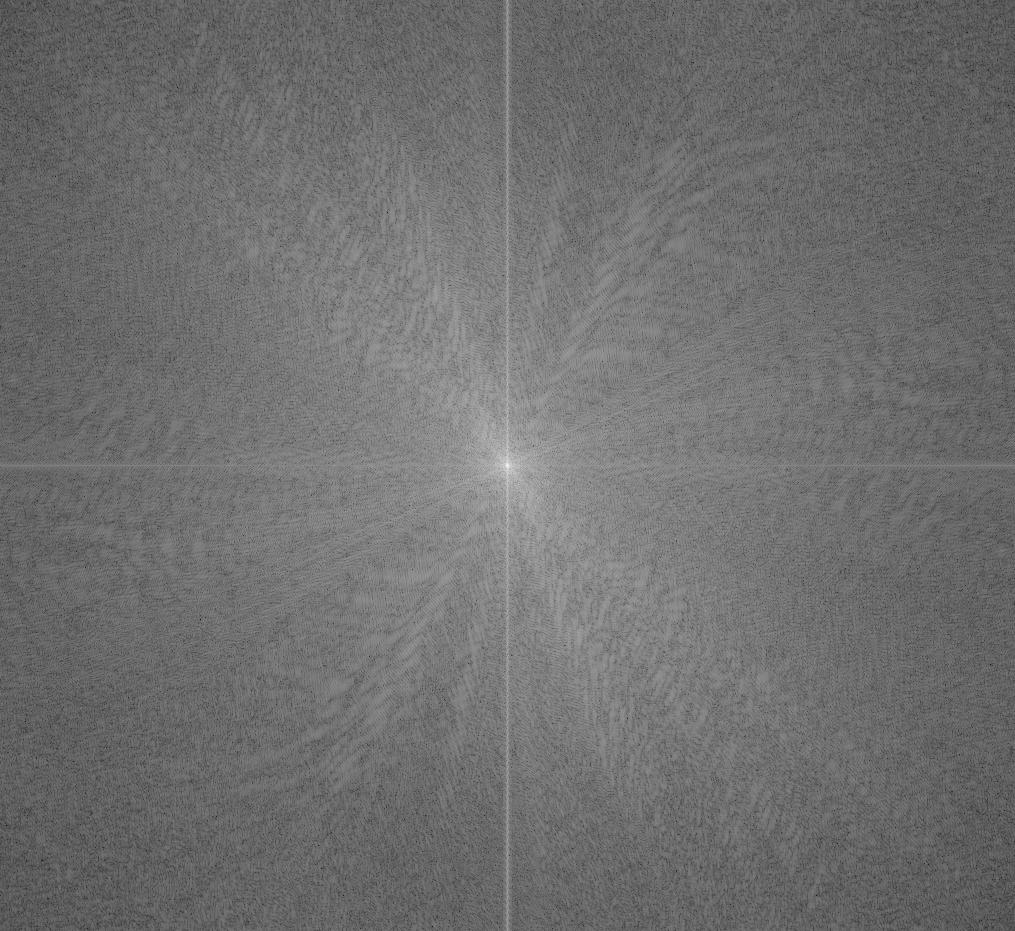
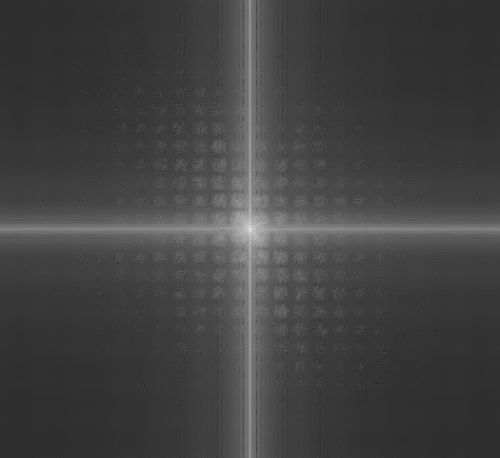
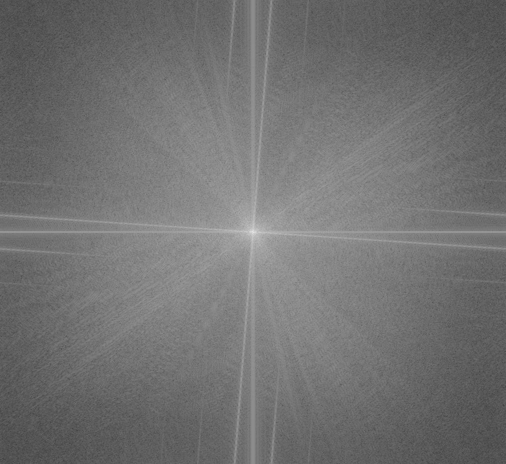
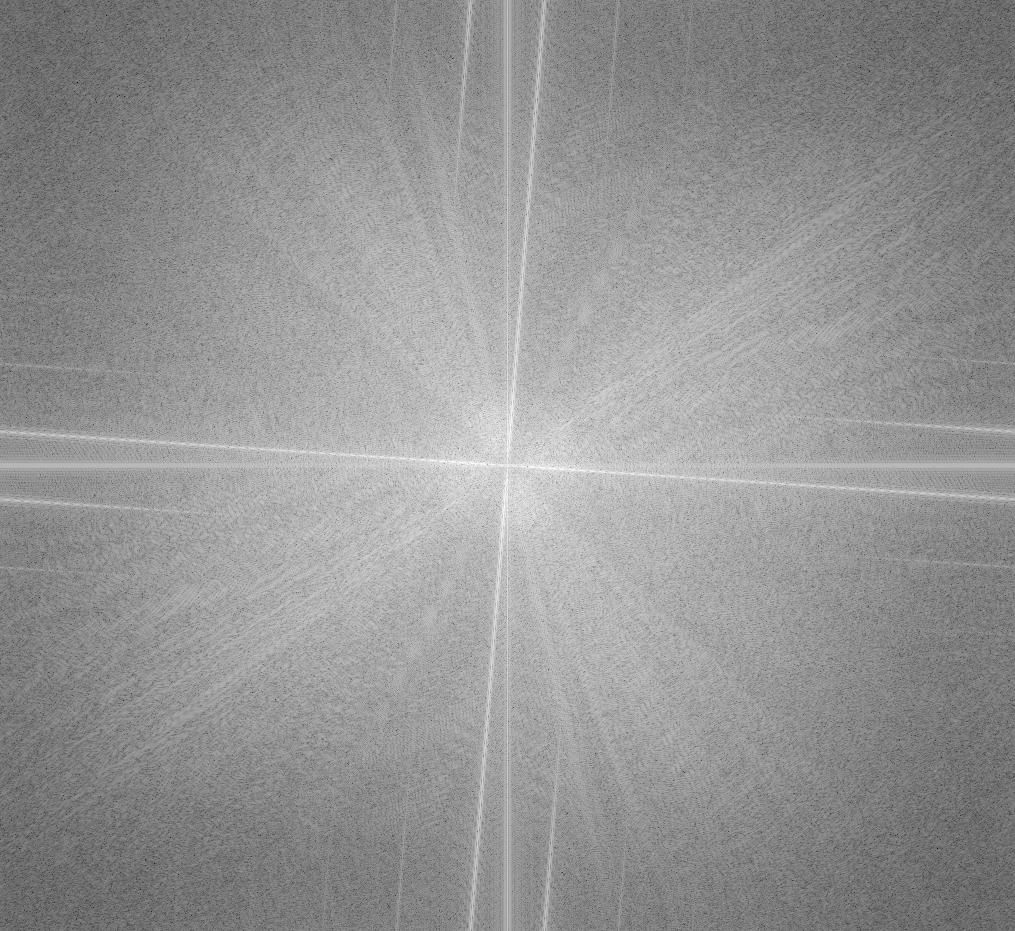
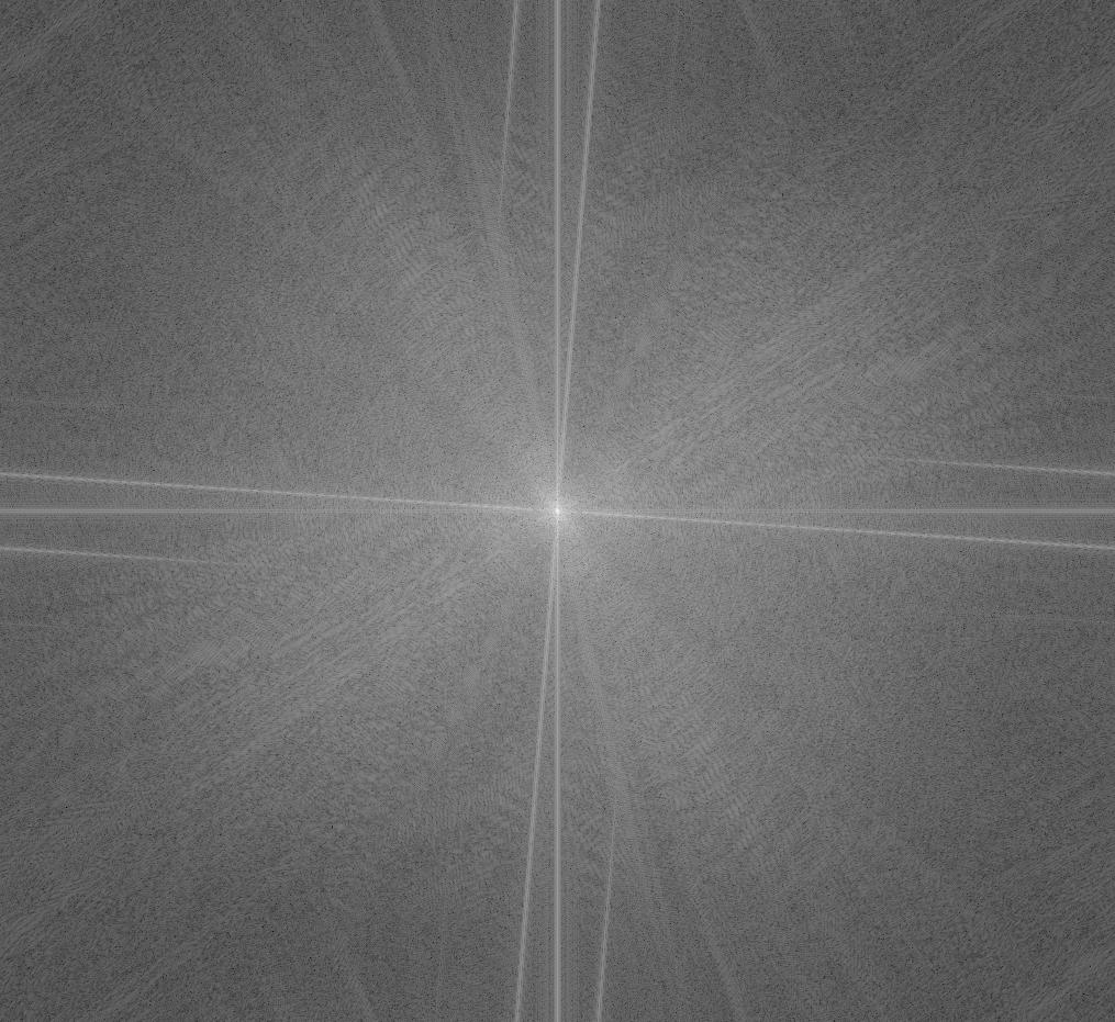
In the Fourier domain, the hybrid image looks very similar to the original Levi. However, you can also see some patterns from the original Gojo in the hybrid, especially in lower frequencies. This aligns with our understanding of a hybrid image as a combination of high and low frequencies from different images.
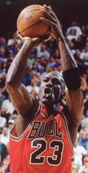
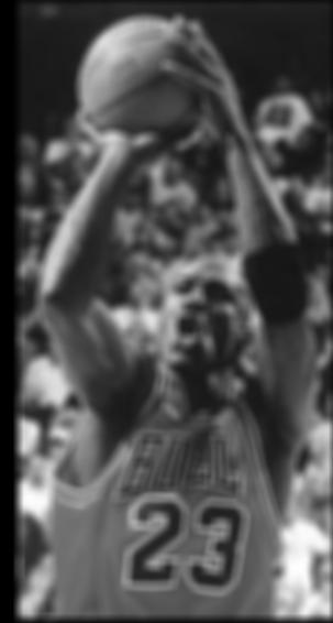
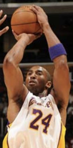
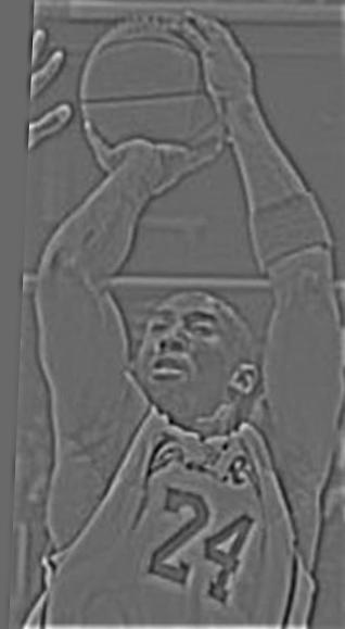
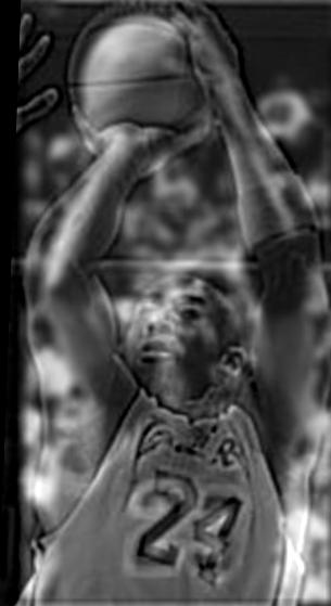
I would say this one was a failure, since there are great structural differences between the two images (the ball and jersey number are aligned, but their heads are not). It is a bit hard to see Kobe close up in the hybrid, so let's try adding color to Kobe's high frequency image.

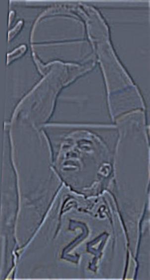
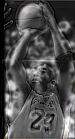
Although slight, Kobe is easier to see up close now. Color is an additional visual queue that we are looking at Kobe when up close (for example, the purple and yellow Lakers jersey).
Let's further explore the frequency representation of images through Gaussian stacks and Laplacian stacks.
First, a Gaussian stack for an image is a series of increasingly blurry images, where each image comes from applying the same Gaussian low-pass filter on the previous image. Intuitively, on each step, we eliminate some range of high frequencies in the image, so we can conceptualize a Gaussian stack as the original image progressively losing its high frequencies.


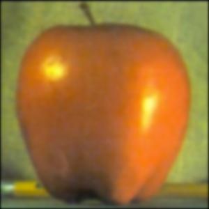
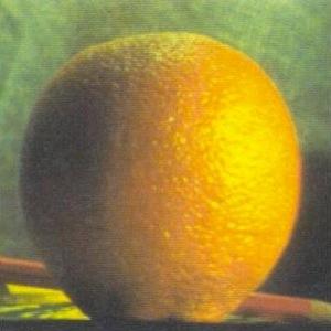


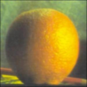

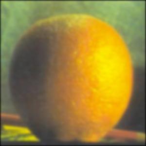
Second, a Laplacian stack for an image is a series of images that captures a specific frequency range. Taking an oversimplified example, suppose an image has frequencies spanning [0, 10] pixels. A Laplacian stack with 3 levels could have the first image capturing the frequencies in [7, 10], the second captures [4, 7], etc. and the third image capturing the remaining frequencies [0, 4]. Intuitively, a Laplacian stack divides the frequency range of an image into "bands" of frequencies, so we can conceptualize a Laplacian stack as the original image decomposed into progressively lower frequency ranges.
We can build a Laplacian stack by first creating a Gaussian stack, then subtracting adjacent entries in the Gaussian stack.
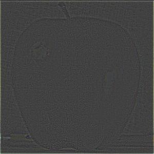
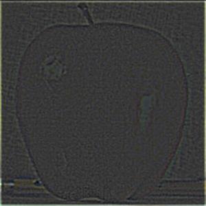
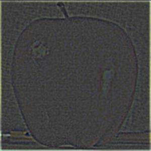
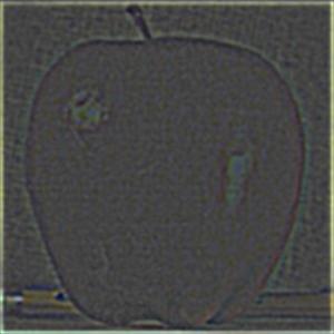
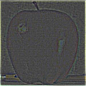

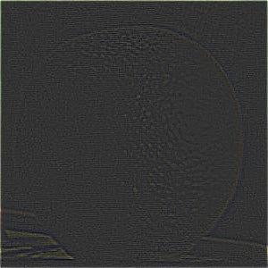
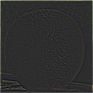
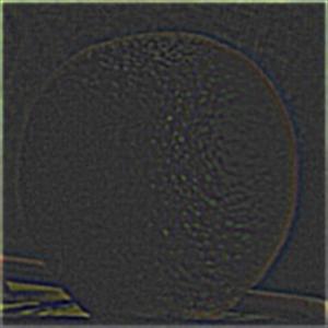
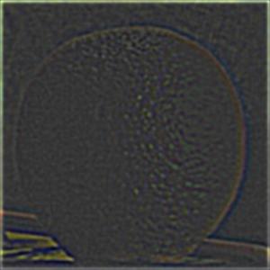
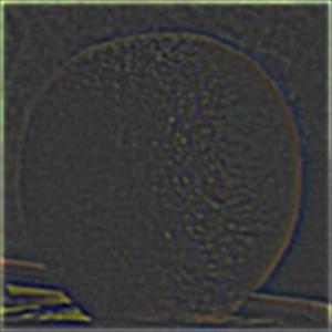

What can we do with these stacks? One cool application is multiresolution blending, or the seamless blending of 2 images.
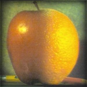
We want to merge an apple and orange to create an 'oraple'. We need a mask to define the place we want to blend the images together, such as the vertical middle line. Then, we want to build up our blended image by considering different frequency bands separately. For high frequency bands, we apply a sharp mask to the sub-band image, and for low frequency bands, we apply a blurry mask to the sub-band image.
Intuitively, this makes sense because it is natural to blend two images by their low frequency structure rather than high frequency details. That is, it would be better to blend the fruits by their smooth surfaces (low frequency) rather than their unique textures (high frequency).
The multiresolution blending algorithm is as follows:
image1, image2, mask1, mask2, n
n layers for mask1, mask2 (say
gstack1, gstack2)
n layers for image1, image2 (say
lstack1, lstack2)
i from 1 to n, created a blended image =
gstack1[i] * lstack1[i] + gstack2[i] * lstack2[i]
n the blended imagesFrom left to right, we have the following at each level: The left mask, the left frequencies * the left mask, the blended image, the right frequencies * the right mask, the right mask. The top level shows the highest frequencies while the bottom level shows the lowest frequencies. Below is the final image.
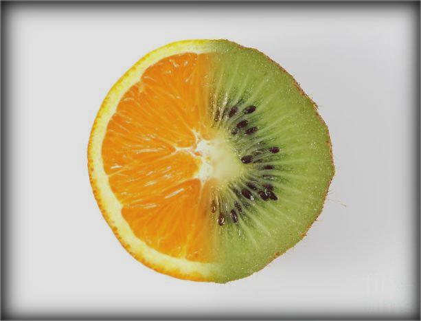
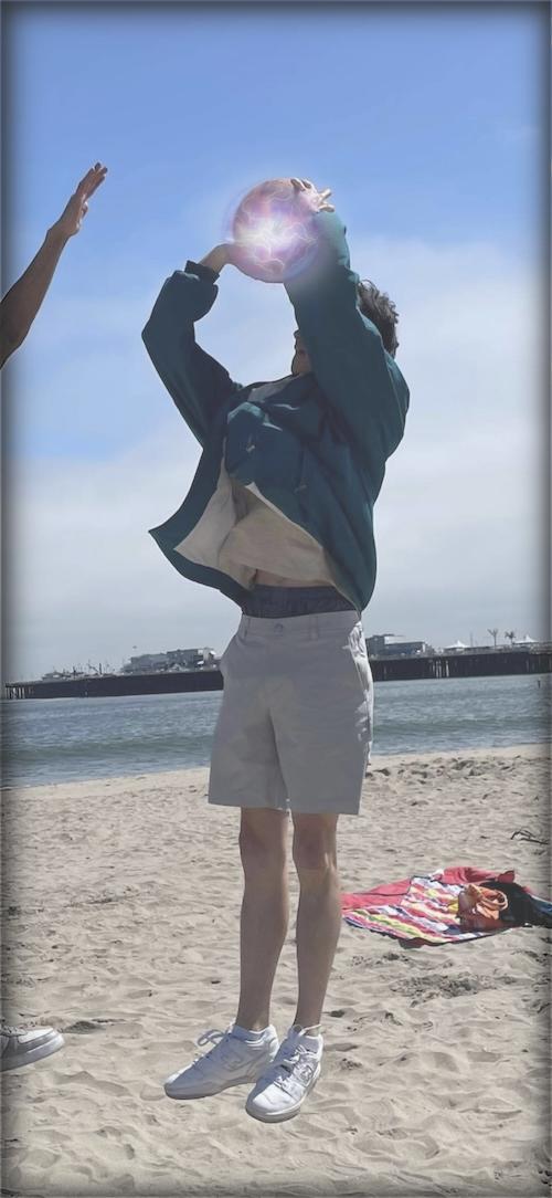
Now we're going to try the same process but with an irregular mask (one that isn't horizontal/vertical).
This project was a ton of fun! The most important thing I learned is that interpreting an image as a bunch of low and high frequency components can be helpful in building intuition on how image processing techniques actually work.